Decision for Story:
For my magazine project, I decided to choose Michael Jackson. My reasoning behind my choice is because I really like Michael Jackson and his music and I felt that it would be a good selection to do a magazine spread about him. Not only was he a wonderful musician but wonderful person. I also felt that any story I chose to do on him would have a lot of vibrant images to choose from for my spread.
Choice of Typeface:
For the cover, I decided to use the font ITC Isadora Std. My reasoning behind this was I felt that it cosigned well with the title of the magazine, Royalty. I felt that it had a very regal, majestic look to it and Michael Jackson is the King of Pop so why not use such a font. I also chose to make it all caps because I feel like upper case lettering gives a sense of power and dominance. For the headline, I chose to use Berling LT Std. The reason why I chose to use this font is because I feel it was a very docile font that coordinated well with the picture on the 1st spread. For the deck head and the alternative copy, I chose to use the font Caxton Std. I chose this font because I feel it coordinate well with the headline and the font. For the body text, I chose ITC Berkeley Old Style because I felt it looked like the font used in magazines.
Images:
The sources and sizes of the images I chose are:
http://pasembur.files.wordpress.com/2009/06/michael_jackson_-_number_ones.jpg
This is the cover photo. It is 1600x1200 pixels.
http://celebrityastrologyblog.com/wp-content/uploads/2009/08/michael_jackson_white_bird_1975.jpg
This is the picture for the first spread. It is 5025x3339 pixels.
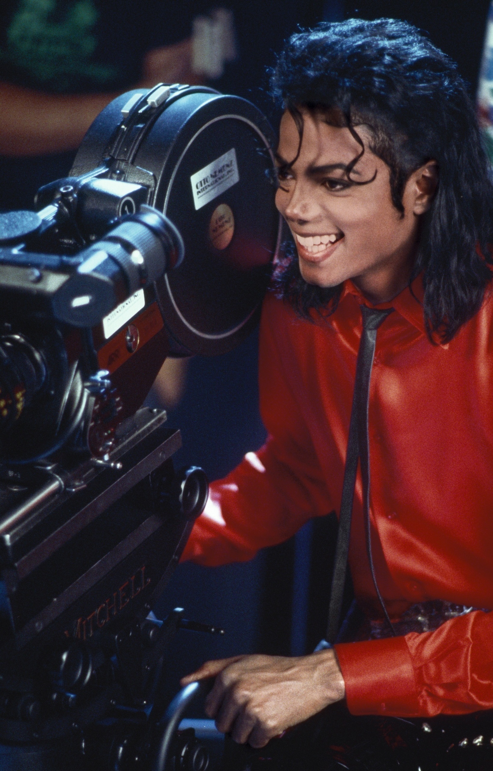
http://images2.fanpop.com/images/photos/7800000/Liberian-Girl-michael-jackson-7848255-1638-2560.jpg
This is the photo within the article. It Is 1638x2560 pixels.
http://www.michaeljackson.ch/thisisitmovie.jpg
This is the photo for the back cover. It is 2017x3000 pixels.
Color:
For the cover, the pull quote and the drop letter, I took the red from Michael Jackson’s pants on the cover, which are R209, G31 and B21. For the headline and deckhead on the first spread I took the green from the background, which is R47, G63 and B50. For the alternative copy I used a gold color which is R235, R167 and B45.