


 Design Strategy:

Strategy:
Since I had already created a poster for the Pawcasso art auction event, I wanted to be able to utilize my design in other ways. Because the event is annual, I thought that creating a website design for it would be the perfect way to go about expanding my design. Therefore, the website mirrors the poster design in several ways, using a similar color scheme and style.
In order to create an effective design, I started out with an enter page. When I go to websites, I feel as if pages that start with a big visual that you must navigate past to get to the actual website builds up intensity and aggrandizes the website. For this reason, I created an enter page with the visual large and prominent in the center, leading the viewer to the rest of the information about the event. All the pages that follow consistently follow the pattern of navigation bar on the right to frame the faded cat picture, and information in the center for easy readability. I used the grid mainly to center and lay out my design.
Typefaces:
Though the website is very similar to the poster design, I used all sans serif typefaces on the website. I felt that fonts such as these, Grotesque MT Std, Myriad Web Pro, Helvetica LT Std, and Myriad Pro, were more consistent with web readability than the serif fonts used in my poster design. In addition, all fonts except for the picture caption have a drop shadow effect on it. Since 3d visuals are more interesting than flat ones, I thought adding a shadow to the type would create dimensionality and interest.




Strategy:
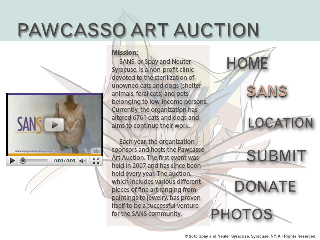
Since I had already created a poster for the Pawcasso art auction event, I wanted to be able to utilize my design in other ways. Because the event is annual, I thought that creating a website design for it would be the perfect way to go about expanding my design. Therefore, the website mirrors the poster design in several ways, using a similar color scheme and style.
In order to create an effective design, I started out with an enter page. When I go to websites, I feel as if pages that start with a big visual that you must navigate past to get to the actual website builds up intensity and aggrandizes the website. For this reason, I created an enter page with the visual large and prominent in the center, leading the viewer to the rest of the information about the event. All the pages that follow consistently follow the pattern of navigation bar on the right to frame the faded cat picture, and information in the center for easy readability. I used the grid mainly to center and lay out my design.
Typefaces:
Though the website is very similar to the poster design, I used all sans serif typefaces on the website. I felt that fonts such as these, Grotesque MT Std, Myriad Web Pro, Helvetica LT Std, and Myriad Pro, were more consistent with web readability than the serif fonts used in my poster design. In addition, all fonts except for the picture caption have a drop shadow effect on it. Since 3d visuals are more interesting than flat ones, I thought adding a shadow to the type would create dimensionality and interest.

Erica Murphy | Website rationale
My non-for-profit event is affiliated with a club that I was involved with in High School. I chose this specific club because it was the club I was the most involved with in high school. I chose the annual bowl-a-thon because I had my own pictures from previous events. I thought that this would make it easier to create a design when I already knew what visuals to use.
Design strategy
I chose to use a 12-grid system because I felt that my containers were too large for the 16-grid system. I also thought that spreading objects and type across two columns was easier to design. I used the same color pink throughout each page and just changed the opacity to create visual continuity. Pink is the official color of the Susan B. Komen foundation, so I thought this worked well with the theme of the bowl-a-thon. I used a bowling ball to dictate which page was the main page and kept the circle theme going with the shape of my pictures. I also used a bowling pin on each page to hold extra information and to help contain the main text.
Choice of Type
I wanted to use somewhat girly and fun fonts to contrast the brown, boyish colors of the bowling ally. I couldn’t find the font I wanted for the headline in suitcase, so I found a font on dafont.com titled Sooperfresh. I used Emmascript for the links on my web pages and trade gothic LT Std for the body text. The script and sans serif fonts provide a nice contrast to each other.


