
 This is an example of an advertisement that uses poor font choice. The ad is intended to promote the subject at hand, which happens to be a Law Group, in an appealing light but fails to do so due to a poor aesthetic appeal. Not only is the font not accentuated at all, but the image itself does not even draw attention. The majority of the picture is consumed by blank space. The font is small and hard to read. It does not capture the viewer's attention, and it fails to be visually appealing. The letters are kearned too close together, so it is hard to differentiate the difference between them and make out words. Although the font is intended to come across as bold through its all caps, it fails in this mission as well because it is so difficult to decipher.
Showing posts with label Bad typography. Show all posts
Showing posts with label Bad typography. Show all posts
Monday, February 1, 2010
Week Two - Schwartz
This is an example of an advertisement that uses poor font choice. The ad is intended to promote the subject at hand, which happens to be a Law Group, in an appealing light but fails to do so due to a poor aesthetic appeal. Not only is the font not accentuated at all, but the image itself does not even draw attention. The majority of the picture is consumed by blank space. The font is small and hard to read. It does not capture the viewer's attention, and it fails to be visually appealing. The letters are kearned too close together, so it is hard to differentiate the difference between them and make out words. Although the font is intended to come across as bold through its all caps, it fails in this mission as well because it is so difficult to decipher.

Week Two | LaSorsa
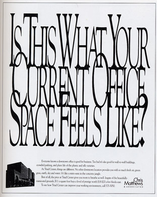 In theory, this is a creative ad. The company, that sells office space, packed the text tightly together to convey crowded space. I believe that the ad does do a good job in making the viewer feel claustrophobic. However, it draws attention to a cluster of letters that are seen as one item instead of individual words. If I knew I would be kerning the letters so tightly, I definitely would have picked a thicker or wider font. The narrow type is even harder to read when it is on top of each other. I would have probably preferred a sans serif font that would have laid smoother on top of each other. The drop cap seems to work well to distinguish between each word. The problem is that the first letter of each word is overlapping awkwardly, making it extremely hard to read. I think they could have made the ad a lot clearer while still conveying the jumbled and crowded message.
Week Two - Igbeare

The ad's attempt to appeal to women conscious of their weight is poorly done. The advertisement is cluttered. It is clear that the different size of fonts were trying to emphasize weight. However, the ad uses too many serif and san serif fonts. The reader's are struggling with what they should read first. The use of color also detracts attention away from the point of the ad. Some words are in a pale pink which makes it harder for the audience to read the whole ad. Many of the words are spaced in the ad. As a result, the ad looks a lot busier. Lastly, they are promoting tape worms as a way to lose weight. No woman would ever eat worms in order to lose pounds.
Subscribe to:
Posts (Atom)


