Welcome to the Official Class Blog of GRA217- Section 4


Showing posts with label erica murphy. Show all posts

Tuesday, April 27, 2010

Website | Murphy


Erica Murphy | Website rationale

Non-for-profit event

My non-for-profit event is affiliated with a club that I was involved with in High School. I chose this specific club because it was the club I was the most involved with in high school. I chose the annual bowl-a-thon because I had my own pictures from previous events. I thought that this would make it easier to create a design when I already knew what visuals to use.

Design strategy

I chose to use a 12-grid system because I felt that my containers were too large for the 16-grid system. I also thought that spreading objects and type across two columns was easier to design. I used the same color pink throughout each page and just changed the opacity to create visual continuity. Pink is the official color of the Susan B. Komen foundation, so I thought this worked well with the theme of the bowl-a-thon. I used a bowling ball to dictate which page was the main page and kept the circle theme going with the shape of my pictures. I also used a bowling pin on each page to hold extra information and to help contain the main text.

Choice of Type

I wanted to use somewhat girly and fun fonts to contrast the brown, boyish colors of the bowling ally. I couldn’t find the font I wanted for the headline in suitcase, so I found a font on dafont.com titled Sooperfresh. I used Emmascript for the links on my web pages and trade gothic LT Std for the body text. The script and sans serif fonts provide a nice contrast to each other.

Monday, April 19, 2010

Magazine | Murphy


Decision to choose story

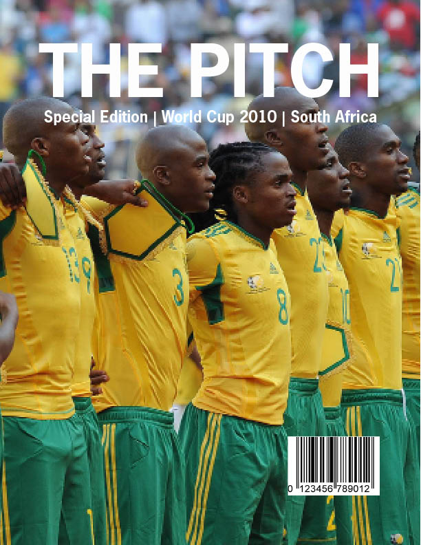
My family and I will be attending the World Cup this summer. We are extremely interested in soccer and were ecstatic to find out that we received tickets through the lottery system. Even though I am passionate about soccer, I do not know much about soccer on a world stage. I thought it would be a good topic to choose, so I can do some research prior to my quest to South Africa. It turned out to be a good decision because I enjoyed researching and looking for pictures. I learned a lot about the topic along the way.

Type

The title of my magazine is in News Gothic Std bold. It is a strong and simple sans serif, which I think fit perfectly with my topic. The World Cup is a prominent event, so it needed classy representation. The body text is Minion Pro in regular. It is a serif with definite readability. I made my captions italic in Myriad Pro because I wanted them to stand out from my body text. To continue with my visual continuity, I also used Myriad Pro in my sidebar, but I chose regular instead of italic. My headline is a more funky type, Khaki Std. I liked how the spots around the letters looked like grass coming up from a field. I thought it fit well with my topic.

Color Information

I pulled most of my colors from the pictures I used on the spreads. The green in my headline is C:75.62 M:23.06 Y:88.72 K:7.49. The green used for the sidebar is C:78.24 M:8.62 Y:73.32 K:0.36. The background of the first spread is automatic and the text is either automatic or white.

Picture Information

-World Cup loge-: www.shine2010.co.za/ Community/blogs/goodnews/- 721KB

-Cover Photo- www.goafrica.com- 623KB

-Main picture on first spread- www.fifa.com/worldcup- 3.3MB

-Main picture on second spread-www.zimbio.com-98KB

-Stephan Pienaar- www.zimbio.com-98KB

-Stadium pictures- www.fifa.com/worldcup- two at 66KB, two at 33KB

Wednesday, March 31, 2010

Week Ten | Murphy


I think sheet music is a good example of a grid structure. Each line of music is equally spaced out horizontally on the page and the right/left sides line up throughout the page. Because music must be read quickly, readability is key. This grid structure strictly separates each line through using white space. Without this repetition, all the music would bunch together and seem impossible to sort through to play. Each white space is the same height and each line of music is the same height. Even the details within the line of music are equally spaced. This is made possible through using a grid structure.

Wednesday, March 24, 2010

Week 9 | Murphy


Week 8 | Murphy


The NBA logo uses the gestalt principles of silhouette and figure and ground. The basketball player in the middle can be seen as a cut out, or it can be seen as part of the whole picture. The use of white in the silhouette works with the color scheme of the American Flag. I think this logo is very effective and appeals to every type of nationality. The player in the middle is simple enough the keep the logo professional, but detailed enough to immediately understand what it is depicting. It definitely utilizes the simplicity of images that represent gestalt principles. It is clean cut and bold which are things I think of that deal with Gestalt.

Sunday, March 7, 2010

Week Seven | Murphy


Unfortunately I was unable to find the commercial on YouTube, but I will try and describe it the best I can. There is an animated pop tart commercial where the pop tarts are making houses. But the pop tarts do not look exactly like they are in the package. It's more that the colors, the decorations, and the textures represent pop tarts. I think these colors represent gestalt principles because the similarity between the colors used in the commercial and the colors on the actual pop tarts are almost identical. Seeing that commercial immediately makes me think of pop tarts. A successful ad or commercial makes you want to get up and go buy the product. This pop tart commercial definitely does that for me.

Thursday, February 25, 2010

Week Six| Murphy

Erica Murphy| Poster Rationale

Design Strategy

The non-profit organization is the Lion’s Club, which is an organization that raises money to help the blind. It represents an older demographic and the events they hold reach an older demographic as well. I thought that a successful way to showcase the “All you can eat breakfast” was to make the poster seem childlike and handmade. This way, it makes the participants think of their grandchildren or children and the handmade projects they used to make as kids.

I was having trouble thinking of an image and slogan that related to the Lion’s Club event. Eventually I drew the similarity between “Lion’s” and the Wizard of Oz. I took “lion’s and tigers and bears” and replaced it with certain aspects of breakfast. I think that this fit well with the child theme because every child knows the Wizard of Oz and every parent knows it as well.

­Choice of typefaces

I wanted the typefaces to look like something a child would pick. The boldness of Antique Olive had a little flair that would attract a child’s eye. It stood out just enough without overtaking any of the other elements of the poster. I chose a serif font for the details so they were easy to read. The serifs on Bembo Std add a little extra to the traditional serif font.

Visuals

I used mostly the pen tool to create my visuals. I traced various pictures and letters in order to create the yellow brick road. I chose a golden yellow (C:10.44 M:23.11 Y: 100 K:0) to represent the yellow brick road and added a filter to give a textured look. I decided to use a gradient for the background color because a plain background looked too bland. The blue and green are supposed to represent grass and sky.

The text and visual follows a “Z” pattern, so the eye is easily able to follow what is going on. I also wanted the poster to bleed because it gives the poster more of a finished look. Also, kids rarely leave space when they color, so their posters certainly would not have white space either.

Wednesday, February 17, 2010

Week Five|Murphy


When I think of Gestalt design principles, I think of objects and pictures that mess with they eyes and force close scrutiny of that object or picture. I think that this poster represents the principles of similarity and figure and ground. All posters that are created out of smaller pictures represent Gestalt principles. Each smaller picture is similar in size and color. This makes it hard for the eye to focus on something because the figure and ground blend together. At one moment, the figure can be Uncle Sam, and the next it can be a bunch of unrecognizable pictures. Gestalt principles are useful when creativity is key, but sometimes they hinder readability. I would be interested in the Uncle Sam poster as decoration, but I would not want it to try and sell me something. There is too much for the eye to focus on for this type of design to be successful as an ad.

Sunday, February 14, 2010

Week Four| Murphy


Erica Murphy | GRA 217.4 | Project 1 Rationale

Design Strategy Once I developed an idea in my head, it was difficult to get it onto paper in a creative way. I knew how I wanted to match the wordmark and headers, but the design for the body of the resume was hard to figure out. The design I chose is simple, easy to follow, and easy to understand. It reflects my ability to know what I need to accomplish and complete it in a successful manner. Whoever reads this understands what I believe is more significant and sees the skills I can bring to the company. After I designed and colored the headers, my resume still looked a little drab. I wanted another touch of style. When looking at my resume, the dates and locations accompanying my experience and education appeared lost on the page. Instead of looking organized, it looked sloppy. Connecting the top lines added order and gave the eye something to follow in a way that made sense.

Choice of Typeface I wanted typefaces that were interesting, but easy to read. I chose the typeface Joanna extra bold for my wordmark because I liked how the M’s connected to make that perfect rectangle. That rectangle added some spark to an otherwise boring name. I preferred a slab serif type because the serifs lined up and looked clean cut. I made all the letters lower case except for the two M’s because it created symmetry on both sides of the M’s. There are 5 letters on each side to once again make my name look clean cut and professional. I used Ellington Mt Std in regular for the body of the resume because it was easy to read, but still caught my eye with the angled, old style serifs. I enjoy the contrast between the two typefaces because they combine style and class, which are qualities I hope to demonstrate in the interview.

ExtrasI added color to my resume to keep it from looking so bland. Each heading is a dark blue, which stands out from the black and white, but not too much . I chose to make one letter a different color and upper case in the headings because I wanted the reader to think back to my name. When there are three reminders, how will my future employer forget me?

Thursday, February 4, 2010

Week Three| Murphy


I agree with Lupton that there is "beauty and wonder of white space," but I think that white space can also be really ineffective. It is definitely not a good idea to clutter up an ad or a page because the message can get lost. However, the message can also get lost when all the eye can see is vast amounts of white. When not used correctly, white space can draw the eye away from the focus of the ad like in the example of the Orrick ad. This ad turns me away from the product or company because I never really look for what the ad is trying to sell me. Instead I focus on the blank areas of the ad. However in the other Ad, the white space draws me in because of how the stethoscope blurs into the background. The object also breaks up the white space, so I’m not looking at a big chunk of emptiness.