Welcome to the Official Class Blog of GRA217- Section 4


Monday, February 1, 2010

Week One | Mikaelian


Not only is the layout of this advertisement unimpressive, the text also has a lot of issues. The text in the largest box is hard to read due to the light blue water drops in the background that blend into the white font. It would be much easier to read if the font was larger and in a different color that didn't blend with the background. Also, a bold sans-serif font in all caps would be much easier to read since it would be thicker, making the eye less confused by the background. It would also be more interesting than this font that has no originality (it looks like somebody just typed a sentence on a background). The catch-phrase is humorous for a beer ad, and it would be much more memorable if a creative font was used that represents the beer better. Also, the text in the lower right-hand box has no relation to the text in the main box, making the advertisement seem extremely unprofessional.

Week Two | LaSorsa

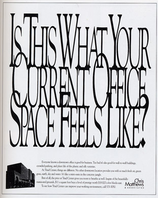
In theory, this is a creative ad. The company, that sells office space, packed the text tightly together to convey crowded space. I believe that the ad does do a good job in making the viewer feel claustrophobic. However, it draws attention to a cluster of letters that are seen as one item instead of individual words. If I knew I would be kerning the letters so tightly, I definitely would have picked a thicker or wider font. The narrow type is even harder to read when it is on top of each other. I would have probably preferred a sans serif font that would have laid smoother on top of each other. The drop cap seems to work well to distinguish between each word. The problem is that the first letter of each word is overlapping awkwardly, making it extremely hard to read. I think they could have made the ad a lot clearer while still conveying the jumbled and crowded message.

Week One - Onushco

In this ad, the advertiser is trying to appeal to the potential consumers by using the professional opinion of a doctor. It could be assumed that, in order to maintain the professionalism, the advertiser would want to use a font that gives the consumer a feeling of seriousness and officialism. Rather, the cigarette company uses font that looks rather playful, which is the exact opposite of what the ad is trying to get across. Even the red lettering displays a playful manner. The company should have gone with a much more serious font.

Week Two - Igbeare


The ad's attempt to appeal to women conscious of their weight is poorly done. The advertisement is cluttered. It is clear that the different size of fonts were trying to emphasize weight. However, the ad uses too many serif and san serif fonts. The reader's are struggling with what they should read first. The use of color also detracts attention away from the point of the ad. Some words are in a pale pink which makes it harder for the audience to read the whole ad. Many of the words are spaced in the ad. As a result, the ad looks a lot busier. Lastly, they are promoting tape worms as a way to lose weight. No woman would ever eat worms in order to lose pounds.

Micro-Assignement: Onushco

Rich, creamy cheesecake drizzled with sweet chocolate syrup. Topped off with a succulent chocolate covered strawberry. A dessert fit for the divine. (would not let me upload picture)

Week One- COHN

After reading the first chapter, "Letter," I have started to learn more about what constitutes good type and bad type. In my opinion, mixing different fonts is not a bad thing as long as it does become confusing for the audience. I think mixing one, two, maybe three fonts max can make a logo or an ad stand out to the reader, but the more fonts used the more difficult it is for the reader to understand what is being said. In the ad about a steamship cruise, where a dozen different fonts are used, it is very difficult to read what is being advertised. To me, it looks like twelve different ads on one page, and until I read the blurb next to the picture I thought it was an old ad for a full moon viewing and live band. It wasn't until I read the blurb that I grasped what the ad was trying to communicate. I think more fonts equal more confusion and less power or efficiency in an advertisement.

Week Two | Palladino

This old-fashioned advertisement is for a machinery and woodworking company, however the true intentions behind it are very confusing. Mixing serifs and a few sans serif typefaces, the advertisement presents itself as very blockish with a bit of circus feel as well. The wavy baselines for the biggest headlines at the top add a creative touch, however as one looks further down the ad, things being to get more and more confusing. The use of a thick serif typeface for the bulk of the detailed paragraph makes it difficult to read. In addition, the strange hyphenations at the end of some of the lines make a reading of this ad very choppy and difficult. I believe if a thinner, sans serif was used for the big paragraph, maybe one similar to the typeface that was used for the words, "Cincinnati. Ohio. USA," the advertisement would be more understandable and less cluttered.