Welcome to the Official Class Blog of GRA217- Section 4


Showing posts with label kerning. Show all posts

Thursday, February 4, 2010

Week Three, Stefaniak


As Lupton says, 'one of design's most humane functions is...to help readers avoid reading." In this picture where the designer has used letters to form an object instead of a word, the design has succeeded. By disrupting, compressing, and migrating the letters, the designer has produced a better effect than if s/he were to simply type "gun" and "bang." The serif of the "r" creates the perfect trigger, just as the serifs elsewhere provide for the perfect outline for the design. It's evident that by manipulating the text, the designer knew that this form of typography was the best way to go.
However, as soon as you look away from the beautifully designed object, it's clear that something's not quite right. Though the thin/thick strokes create a perfect design for the gun, they detract from the threatening message of the actual words. The kerning/tracking adds to the skew of the message, replacing fear with delicate overused typeface. Overall, though half effective as a typeface, word exercise has proven to be extremely beneficial for this design.

Monday, February 1, 2010

Week Two | LaSorsa

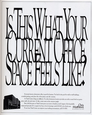
In theory, this is a creative ad. The company, that sells office space, packed the text tightly together to convey crowded space. I believe that the ad does do a good job in making the viewer feel claustrophobic. However, it draws attention to a cluster of letters that are seen as one item instead of individual words. If I knew I would be kerning the letters so tightly, I definitely would have picked a thicker or wider font. The narrow type is even harder to read when it is on top of each other. I would have probably preferred a sans serif font that would have laid smoother on top of each other. The drop cap seems to work well to distinguish between each word. The problem is that the first letter of each word is overlapping awkwardly, making it extremely hard to read. I think they could have made the ad a lot clearer while still conveying the jumbled and crowded message.