
Friday, May 7, 2010
Week Fifteen, Stefaniak
Tuesday, April 27, 2010
Week Fourteen Part 2, Stefaniak


Strategy:
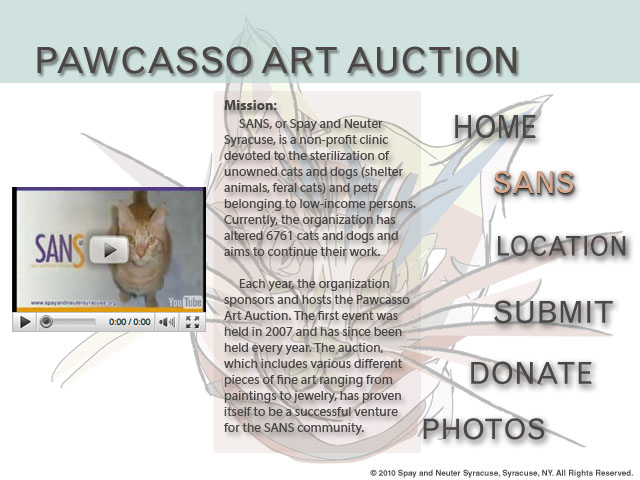
Since I had already created a poster for the Pawcasso art auction event, I wanted to be able to utilize my design in other ways. Because the event is annual, I thought that creating a website design for it would be the perfect way to go about expanding my design. Therefore, the website mirrors the poster design in several ways, using a similar color scheme and style.
In order to create an effective design, I started out with an enter page. When I go to websites, I feel as if pages that start with a big visual that you must navigate past to get to the actual website builds up intensity and aggrandizes the website. For this reason, I created an enter page with the visual large and prominent in the center, leading the viewer to the rest of the information about the event. All the pages that follow consistently follow the pattern of navigation bar on the right to frame the faded cat picture, and information in the center for easy readability. I used the grid mainly to center and lay out my design.
Typefaces:
Though the website is very similar to the poster design, I used all sans serif typefaces on the website. I felt that fonts such as these, Grotesque MT Std, Myriad Web Pro, Helvetica LT Std, and Myriad Pro, were more consistent with web readability than the serif fonts used in my poster design. In addition, all fonts except for the picture caption have a drop shadow effect on it. Since 3d visuals are more interesting than flat ones, I thought adding a shadow to the type would create dimensionality and interest.
Week Fourteen, Stefaniak


Strategy:
Since I had already created a poster for the Pawcasso art auction event, I wanted to be able to utilize my design in other ways. Because the event is annual, I thought that creating a website design for it would be the perfect way to go about expanding my design. Therefore, the website mirrors the poster design in several ways, using a similar color scheme and style.
In order to create an effective design, I started out with an enter page. When I go to websites, I feel as if pages that start with a big visual that you must navigate past to get to the actual website builds up intensity and aggrandizes the website. For this reason, I created an enter page with the visual large and prominent in the center, leading the viewer to the rest of the information about the event. All the pages that follow consistently follow the pattern of navigation bar on the right to frame the faded cat picture, and information in the center for easy readability. I used the grid mainly to center and lay out my design.
Typefaces:
Though the website is very similar to the poster design, I used all sans serif typefaces on the website. I felt that fonts such as these, Grotesque MT Std, Myriad Web Pro, Helvetica LT Std, and Myriad Pro, were more consistent with web readability than the serif fonts used in my poster design. In addition, all fonts except for the picture caption have a drop shadow effect on it. Since 3d visuals are more interesting than flat ones, I thought adding a shadow to the type would create dimensionality and interest.
Thursday, April 22, 2010
Week Thirteen, Stefaniak
 I think this website, poetryfoundation.org, is extremely successful in its use of grids and hierarchy in its web design. Each section in the navigation bar is appropriately titled in a color that contrasts the subdivisions of each title, and they're equally spaced according to the grid system. The meat of the website, the center, is also nicely designed, leading to a very effective and easy to navigate website that's perfect for newcomers and seasoned visitors alike. Along with the website's coherence and clarity in hierarchy, the colors lend themselves to a calming and serene, yet classy design. It's one of my more favored websites to visit.
Monday, April 12, 2010
Week Twelve, Stefaniak


Story:
When I chose a story, I wanted to pick something that would cater to my interests as well as provide an interesting story to direct and read. I love the band MGMT, so choosing an article about them to art direct seemed like it would be a project in which I would be able to really get involved while working on it. In addition, the band itself is interesting and kooky enough for me to create an interesting layout to match their style. I knew that this article would provide for a fun designing experience and not just be another homework project.
Typefaces:
For the nameplate and folios I wanted to keep to a simple typeface, so I chose a sans serif, Avenir LT Std Black and Book. To complement this in the cover lines, I used Melior Std Regular. For the headline and deck head I used LinoLetter Std in various weights and postures to give the article a personal touch that deviates from the regular serif fonts. For the body text and captions I used ITC Stone Serif Std in Medium and Medium Italic for its clarity and readability.
Sources:
1. Back Cover Image 1: 8-465x576.jpg, http://mgmt-congratulations.com/about, 72 dpi
2. Back Cover Image 2: stripe_jacobs_072507.jpg, http://www.boston.com/yourlife/home/stylephile/clothing_fashion/, 72 dpi
3. Cover Image: 3674536051_ec13cb1d09.jpg, http://flickr.com/photos/60839574@N00/3674536051/, 72 dpi
4. Cover Barcode: barcode.png, http://ceoworld.biz/ceo/2009/11/14/best-barcode-label-design-software-barcode-label-printing-image-applications, 72 dpi
5. Spread 1: spin-mgmt-3-large.jpg, http://www.spin.com/articles/mgmt-head-games, 72 dpi
6. Spread 2: spin-mgmt-4-large.jpg, http://www.spin.com/articles/mgmt-head-games, 72dpi
7. Spread 3: Big-MGMT2-1.jpg, http://www.soundproofmagazine.com/SoundProof/News/Headlines_for_July_1_2009.html, 72 dpi
Color Information:
In order to design the color scheme of the layout, I used the Lab CMYK color palette. Specifically, I tried to play off the description the band use to describe their music, “future 70’s.” To do this, I tried to mimic the colors of the picture in the first spread as well as possible throughout the rest of the spread. To do so I varied between different shades of orange, yellow, red, and pink at different opacities to get the desired effect. For the image on the second spread, I covered it with a low opacity rectangle of color to make it more like the first image and for third spread image, I edited it in Photoshop so that it had the same gradient effect as the first spread.
Thursday, April 8, 2010
Week Eleven, Stefaniak

Thursday, April 1, 2010
Week Ten, Stefaniak
 In this design, I've found the grid system to be quite useful. Though the grid usually isn't made visible to the viewer and is instead presumed to be there, this grid can be clearly seen. The lines of the grid are white, thin, and numerous, giving clarity to the design. Since every box contains a different pattern that together forms the full picture of a wolf, the grid proves itself to be very useful. If the grid wasn't there, then the entire picture probably would've looked like messy as a mesh of different patterns. Instead, the grid pattern provides visual interest and aids continuity, a Gestalt principle, for the design.
Friday, March 26, 2010
Week Nine, Stefaniak


Strategy:
I wanted to create a logo for myself that was simple and modern yet described my personality and sparked interest in the receiver. I knew that since my name isn’t visual, I needed to take a different approach to creating a logo. Though I’m not sure in which field exactly I want to go, I knew I wanted to create a design that mirrored graphic design, the field in which I'm considering entering in the magazine industry.
Typefaces:
I chose a serif typeface, Americana Std Extra Bold, for the logo itself because it created a thick and bold feel for the four grouped letters. For my name under the logo and the name and address on the back of the envelope I used Cochin Lt Std to mirror the bold feel of the logo above, yet it adds contrast because of its cleanness. I then chose ITC Veljovic Std Book for the back of the business card and the address on the stationery because it followed the same serif pattern but it created easy readability and wasn’t too bold in contrast to the logo.
Visuals:
For the logo mark, I typed out each individual letter in Illustrator, drew a line above and below where I wanted the letters to reach, and then adjusted each letter so that it fit perfectly between the lines. I then changed each color of the letter to follow the design that I wanted, moved them inward so that they would overlap, and then changed the opacity so that the color of the letter underneath would show through, creating visual interest. Since I wanted to create a graphic design feel, I chose to manipulate the CMYK pattern in a way that reflects my personality while retaining the classic design pattern. Therefore the letters in order are variations of CMYK, though I chose to change the last letter, T, to an interesting color that pops and doesn’t get too lost in the standard graphics color scheme.
Thursday, March 11, 2010
Week Eight, Stefaniak
 “Sinkit is a tool used to improve a golfer’s putting skills. For the name, we generated over fifty possible options and singled out Sinkit for its distinctness, phonetic appeal, and meaning. Sinkit’s logo reflects the purpose and effectiveness of the putting aid. The logo’s letterforms have unique characteristics—a balanced construction of geometric curves and precise angles—that suggest ideas of accuracy, technique, and advancement.” -from the logo creator
Thursday, March 4, 2010
Week Six, Stefaniak
 In this image, the Gestalt principle of continuity through color is successfully represented. Once you see the image of the cat in the background and the vivid blues and purples on its tongue, that contrast with its white fur, your eyes are immediately pointed downwards following the direction of the tongue to the snow-cone. The colors in the tongue, blue and purple, are mirrored onto the snow-cone, presenting the viewer with continuity between the two objects in the picture. The continuity works so well that it isn't until looking at the picture further do you wonder why a cat is licking a snow-cone in the first place. The Gestalt principle of continuity had allowed color to link the opposed images together in a fun way.
Wednesday, February 24, 2010
Week Six, Stefaniak

Design Strategy:
I wanted to create a poster that intrigues the audience in a visual and modern way as well as create interest in the event and its purpose. In addition, I aimed to broaden the scope past the regular audience that art auctions target since they mostly attract art and animal lovers. In having relatively no parameters, (my organization was paired with a larger organization for this event), I was able to create my design to the best of my ability using full color and design.
Typefaces:
Since the design is intricate and multi-layered, I felt that a sans serif font would work best for the headline. Folio Std provides the design with a coherent typeface that mirrors the thin and thick brushstrokes of the cat. To further imitate the picture, I decided to use the medium weight for the main words “Support” and “Pawcasso,” and the light weight for the words in between. I felt this also sandwiched in the message to create a compressed and direct headline. For the information below the headline, I decided to use a complimentary sans serif typeface, Gill Sans Regular, to tie in the information to the design.
Visuals:
I created the visual in Adobe Illustrator by using a mixture the different tools (pen, pencil, paint) and CMYK color and its adjustments. I wanted to hand draw a visual that combines Picasso’s style of art and the use of an animal to pull in the main headline and the event. The use of duller CMYK colors adds a modern flair to the otherwise heavy color palette that Picasso used; otherwise, I would have added too much bulk to the design and lost the connection between the picture and the event. In keeping the design modern, I wanted it to rest on a soft background that compliments the color; I used CMYK in InDesign and adjusted the colors.
Friday, February 19, 2010
Week Five, Stefaniak

Thursday, February 11, 2010
Week Four, Stefaniak

Strategy:
In today’s business world where staying on the current edge is crucial to success in the workplace, it’s important to have an equally current résumé. Especially in the art magazine field, using an outdated design or typeface might be the crucial error that causes a person to be passed over during the application process. For this reason, I’ve tried to produce a resume that reflects my personality as well as mold to the newly changing magazine field. In order to keep up with the flux and uncertainty of the future of magazines, my résumé’s goal is to provide prospective employers with a reason to hire me and help sustain the “dying medium.”
Likewise, I also set guidelines for myself in order to ensure a great résumé. By keeping to a simple design, my achievements and experience are able to stand out amid the rounded rectangles and crisp lines. But in using shapes as dividers and headers, I knew that a fresh color would make them pop; the pea green adds cleanness and originality to an otherwise black type résumé. Though my objective in my résumé is to become an editor/writer, the overall current theme of my résumé will help me break into the design-centered field of art magazines.
Typefaces:
Helvetica Neue UltraLight felt like the best choice for the wordmark and headline. Since it’s a sans serif, it provides the résumé with a streamlined and succinct effect that allows me for the use all caps without making it seem as if I’m too loud or forceful. The thinness of the font really worked for the design. In addition, Gill Sans Light seems to be the perfect complement for the body type. Not only does it continue the pattern of sans serif type throughout the résumé, but the weight and posture also allow for easy readability and cohesion, something I feel is important for a résumé.
Thursday, February 4, 2010
Week Three, Stefaniak

Saturday, January 30, 2010
"Letter Response," Stefaniak

Micro-Assignment, Stefaniak

Creamy, delicious ice cream that's also pleasing to the eye. The green tea base makes it taste healthier than most desserts, too!