


Decision to choose story
My family and I will be attending the World Cup this summer. We are extremely interested in soccer and were ecstatic to find out that we received tickets through the lottery system. Even though I am passionate about soccer, I do not know much about soccer on a world stage. I thought it would be a good topic to choose, so I can do some research prior to my quest to South Africa. It turned out to be a good decision because I enjoyed researching and looking for pictures. I learned a lot about the topic along the way.
Type
The title of my magazine is in News Gothic Std bold. It is a strong and simple sans serif, which I think fit perfectly with my topic. The World Cup is a prominent event, so it needed classy representation. The body text is Minion Pro in regular. It is a serif with definite readability. I made my captions italic in Myriad Pro because I wanted them to stand out from my body text. To continue with my visual continuity, I also used Myriad Pro in my sidebar, but I chose regular instead of italic. My headline is a more funky type, Khaki Std. I liked how the spots around the letters looked like grass coming up from a field. I thought it fit well with my topic.
Color Information
I pulled most of my colors from the pictures I used on the spreads. The green in my headline is C:75.62 M:23.06 Y:88.72 K:7.49. The green used for the sidebar is C:78.24 M:8.62 Y:73.32 K:0.36. The background of the first spread is automatic and the text is either automatic or white.
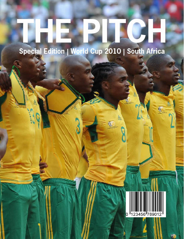
Picture Information
-World Cup loge-: www.shine2010.co.za/ Community/blogs/goodnews/- 721KB
-Cover Photo- www.goafrica.com- 623KB
-Main picture on first spread- www.fifa.com/worldcup- 3.3MB
-Main picture on second spread-www.zimbio.com-98KB
-Stephan Pienaar- www.zimbio.com-98KB
-Stadium pictures- www.fifa.com/worldcup- two at 66KB, two at 33KB

