
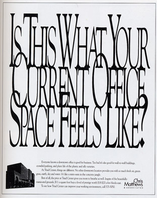
 In theory, this is a creative ad. The company, that sells office space, packed the text tightly together to convey crowded space. I believe that the ad does do a good job in making the viewer feel claustrophobic. However, it draws attention to a cluster of letters that are seen as one item instead of individual words. If I knew I would be kerning the letters so tightly, I definitely would have picked a thicker or wider font. The narrow type is even harder to read when it is on top of each other. I would have probably preferred a sans serif font that would have laid smoother on top of each other. The drop cap seems to work well to distinguish between each word. The problem is that the first letter of each word is overlapping awkwardly, making it extremely hard to read. I think they could have made the ad a lot clearer while still conveying the jumbled and crowded message.
Monday, February 1, 2010
Week Two | LaSorsa
In theory, this is a creative ad. The company, that sells office space, packed the text tightly together to convey crowded space. I believe that the ad does do a good job in making the viewer feel claustrophobic. However, it draws attention to a cluster of letters that are seen as one item instead of individual words. If I knew I would be kerning the letters so tightly, I definitely would have picked a thicker or wider font. The narrow type is even harder to read when it is on top of each other. I would have probably preferred a sans serif font that would have laid smoother on top of each other. The drop cap seems to work well to distinguish between each word. The problem is that the first letter of each word is overlapping awkwardly, making it extremely hard to read. I think they could have made the ad a lot clearer while still conveying the jumbled and crowded message.
Subscribe to:
Post Comments (Atom)
I agree with your comments, Danielle. This really is a well thought out advertisement, however the typeface size, kerning and overlapping does make it challenging to read. However I think maybe the advertisers knew that. Don't get me wrong, I don't pretend to know exactly what the advertisers meant to do by this ad, but maybe they wanted to make it difficult to read because they wanted to convey a sense of irritation and difficulty that many people commonly experience when working in close quarters in an office setting. Maybe people in that situation can relate to the incomprehensibility of the advertisement and would be drawn in by the similarities. Who knows?
ReplyDelete