Welcome to the Official Class Blog of GRA217- Section 4


Friday, April 23, 2010

Web Hierarchy - Igbeare


JustJared.com is a good example of web hierarchy. The website is a bright color of blue and yellow. However it isn't distracting the readers from the content. In addition, the website offers navigational links and a search bar at the top of the website. It also offers viewers links to social media sites as well. The font seems to be a standard Arial font which makes the readability easy. The title of the wensite uses a funky font that attracts readers. Although it is the largest font size, it doesn't detract the viewers attention. The website provides many links that adhere to the readers interest.

Web Hierarchy - Rinder


New York Magazine's website, I think, has a great hierarchy. Across the top is a navigation bar leading the user to potential pages they can visit. When the mouse scrolls over a page, a drop-down bar appears giving the user even more specific options within that subject page. Then, in the fashion page, for example, there is a sidebar navigation with more subheads. This is in a different container than the main text on the page so the user knows it's a navigation box.
The light blue text shows the user that these will open a new article or link.

Web Hierarchy | Palladino

The food Web site Chocolate & Zucchini shows nice use of hierarchy in it's design. The title of the site is dominant on the page, and directly below it is the navigation bar, which uses a handwriting typeface to mimic the handwriting used when writing recipes. When the mouse clicks on one of the navigations, the word is underlined to show which page has been selected. The color scheme used also ties together with the title of the site visually, with chocolate being brown and zucchini being green. That color scheme is followed throughout the entire site, making Chocolate & Zucchini a very well-designed Web page.

Thursday, April 22, 2010

Week Thirteen, Stefaniak

I think this website, poetryfoundation.org, is extremely successful in its use of grids and hierarchy in its web design. Each section in the navigation bar is appropriately titled in a color that contrasts the subdivisions of each title, and they're equally spaced according to the grid system. The meat of the website, the center, is also nicely designed, leading to a very effective and easy to navigate website that's perfect for newcomers and seasoned visitors alike. Along with the website's coherence and clarity in hierarchy, the colors lend themselves to a calming and serene, yet classy design. It's one of my more favored websites to visit.

Monday, April 19, 2010

Magazine | Murphy


Decision to choose story

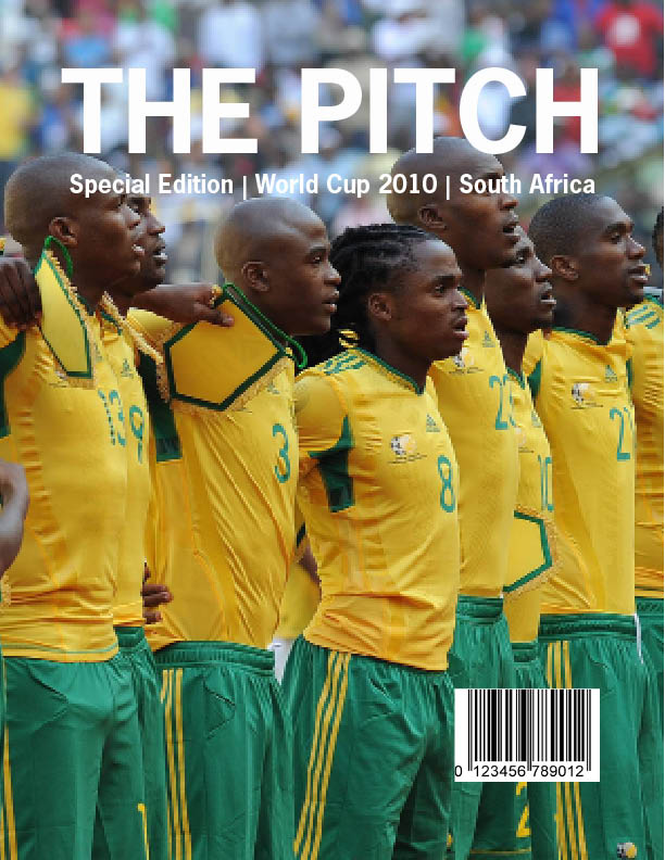
My family and I will be attending the World Cup this summer. We are extremely interested in soccer and were ecstatic to find out that we received tickets through the lottery system. Even though I am passionate about soccer, I do not know much about soccer on a world stage. I thought it would be a good topic to choose, so I can do some research prior to my quest to South Africa. It turned out to be a good decision because I enjoyed researching and looking for pictures. I learned a lot about the topic along the way.

Type

The title of my magazine is in News Gothic Std bold. It is a strong and simple sans serif, which I think fit perfectly with my topic. The World Cup is a prominent event, so it needed classy representation. The body text is Minion Pro in regular. It is a serif with definite readability. I made my captions italic in Myriad Pro because I wanted them to stand out from my body text. To continue with my visual continuity, I also used Myriad Pro in my sidebar, but I chose regular instead of italic. My headline is a more funky type, Khaki Std. I liked how the spots around the letters looked like grass coming up from a field. I thought it fit well with my topic.

Color Information

I pulled most of my colors from the pictures I used on the spreads. The green in my headline is C:75.62 M:23.06 Y:88.72 K:7.49. The green used for the sidebar is C:78.24 M:8.62 Y:73.32 K:0.36. The background of the first spread is automatic and the text is either automatic or white.

Picture Information

-World Cup loge-: www.shine2010.co.za/ Community/blogs/goodnews/- 721KB

-Cover Photo- www.goafrica.com- 623KB

-Main picture on first spread- www.fifa.com/worldcup- 3.3MB

-Main picture on second spread-www.zimbio.com-98KB

-Stephan Pienaar- www.zimbio.com-98KB

-Stadium pictures- www.fifa.com/worldcup- two at 66KB, two at 33KB

Saturday, April 17, 2010

Week 13-Stanislaus


Decision for Story:

For my magazine project, I decided to choose Michael Jackson. My reasoning behind my choice is because I really like Michael Jackson and his music and I felt that it would be a good selection to do a magazine spread about him. Not only was he a wonderful musician but wonderful person. I also felt that any story I chose to do on him would have a lot of vibrant images to choose from for my spread.

Choice of Typeface:

For the cover, I decided to use the font ITC Isadora Std. My reasoning behind this was I felt that it cosigned well with the title of the magazine, Royalty. I felt that it had a very regal, majestic look to it and Michael Jackson is the King of Pop so why not use such a font. I also chose to make it all caps because I feel like upper case lettering gives a sense of power and dominance. For the headline, I chose to use Berling LT Std. The reason why I chose to use this font is because I feel it was a very docile font that coordinated well with the picture on the 1st spread. For the deck head and the alternative copy, I chose to use the font Caxton Std. I chose this font because I feel it coordinate well with the headline and the font. For the body text, I chose ITC Berkeley Old Style because I felt it looked like the font used in magazines.

Images:

The sources and sizes of the images I chose are:

http://pasembur.files.wordpress.com/2009/06/michael_jackson_-_number_ones.jpg

This is the cover photo. It is 1600x1200 pixels.

http://celebrityastrologyblog.com/wp-content/uploads/2009/08/michael_jackson_white_bird_1975.jpg

This is the picture for the first spread. It is 5025x3339 pixels.

http://images2.fanpop.com/images/photos/7800000/Liberian-Girl-michael-jackson-7848255-1638-2560.jpg

This is the photo within the article. It Is 1638x2560 pixels.

http://www.michaeljackson.ch/thisisitmovie.jpg

This is the photo for the back cover. It is 2017x3000 pixels.

Color:

For the cover, the pull quote and the drop letter, I took the red from Michael Jackson’s pants on the cover, which are R209, G31 and B21. For the headline and deckhead on the first spread I took the green from the background, which is R47, G63 and B50. For the alternative copy I used a gold color which is R235, R167 and B45.


Friday, April 16, 2010

Mikaelian- Week 13

I decided to make my layout about Lady Gaga. Even though she was a common topic, I couldn't pass it up since she has amazing photographs and a very strong, energetic look that is perfect for this project.

Story and Layout:

I chose this particular story because it focused a lot on how unique Lady Gaga is, and how she idolizes pop art- especially Andy Warhol and high fashion. I felt that this is important because even though she is known for her crazy style and overall persona, she truly is talented and she is influenced by real art. Because this was the focus of the article I decided to title my magazine Avant Garde, which refers to new and different takes on fine art. I felt this represents Lady Gaga perfectly- she is an innovator of pop music and is turning it into real art.I decided to use a cover with a plain white background and a picture of her in a black jumpsuit. I felt this showed how high fashion influences her, and it was raw and edgy just as she is. I used a single headline in black text to keep the magazine looking clean and modern. I also created an alternative color that was influenced more by the pop art aspect of Lady Gaga. The pop art cover has a picture of Lady Gaga that looks like a colorful, Warhol-esque pop art image, and the main colors used are pink and white. The purpose of creating two covers is so magazine subscribers would get one cover or the other, adding an element of surprise.

The first spread uses the same font from the cover in the headline, plus a typeface called Flood to add a little flare the the headline. On the right side I used a picture of Lady Gaga with pink/coral hair on a white background. I used the coral color of her hair for the Flood text on the left hand side to create continuity. I also created an extremely light mint green background design to put behind the headline, so that the pages weren't too white. I carried the color onto the second spread for continuity. I also used the font and colors from the headline for my pull-quote, and drop-caps.

On the second spread, my sidebar is a quiz to test the reader's Lady Gaga knowledge. For the side bar background I used the same mint green color, and also used the flood font in the coral color to add more continuity.

Choice of Typefaces:

I wanted the typeface for my magazine title to represent what I think fine art is- sophisticated and stylish. I decided to use Didot, which I also used for my story headline and pull quotes. I felt this font looks very classy, but isn't boring.

For my body text I used Berham. I felt that it compliments Didot well and is also different, but still classic. I used ITC Berklee bold for my captions and I used different fonts in my sidebar since it is a different entity than the article.

I used the font Flood for part of my title and throughout my spreads, such as the title of my sidebar and the dropcap in my story. I felt since this font was the most unique and exciting, and it's used in a coral color which makes it stand out, that it would make the layout more appealing and more fun to read.

Images:

I explained the images I used for my cover already, but I mainly chose them because they both represent Lady Gaga and the article in different ways. By creating two different covers, it allows readers to see the two different sides of Lady Gaga- couture fashion and wild pop art.

For my first spread I used a photo that was similar to the cover image with the white background. I found the image very striking and it shows her quirkiness and her eye for fashion at the same time. I felt the white background and her pink hair really catches the viewer's eye.

For the second spread I cut out an image of Lady Gaga in an outfit similar to what she's wearing on the first spread- white with studs- where she is sitting and looking up. I placed this image on the bottom left of the left page so it looked like she was sitting on the folio and looking up at the pullquote that I placed about the picture. On the right page I used another image with a white background and where she was pink hair, once again focusing on her artistic and fashion-forward image.