


Decision to choose story
My family and I will be attending the World Cup this summer. We are extremely interested in soccer and were ecstatic to find out that we received tickets through the lottery system. Even though I am passionate about soccer, I do not know much about soccer on a world stage. I thought it would be a good topic to choose, so I can do some research prior to my quest to South Africa. It turned out to be a good decision because I enjoyed researching and looking for pictures. I learned a lot about the topic along the way.
Type
The title of my magazine is in News Gothic Std bold. It is a strong and simple sans serif, which I think fit perfectly with my topic. The World Cup is a prominent event, so it needed classy representation. The body text is Minion Pro in regular. It is a serif with definite readability. I made my captions italic in Myriad Pro because I wanted them to stand out from my body text. To continue with my visual continuity, I also used Myriad Pro in my sidebar, but I chose regular instead of italic. My headline is a more funky type, Khaki Std. I liked how the spots around the letters looked like grass coming up from a field. I thought it fit well with my topic.
Color Information
I pulled most of my colors from the pictures I used on the spreads. The green in my headline is C:75.62 M:23.06 Y:88.72 K:7.49. The green used for the sidebar is C:78.24 M:8.62 Y:73.32 K:0.36. The background of the first spread is automatic and the text is either automatic or white.
Picture Information
-World Cup loge-: www.shine2010.co.za/ Community/blogs/goodnews/- 721KB
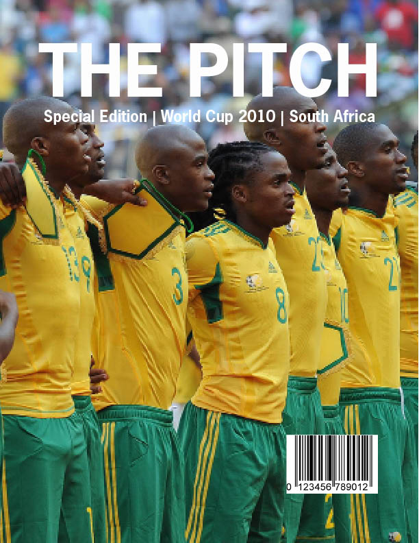
-Cover Photo- www.goafrica.com- 623KB
-Main picture on first spread- www.fifa.com/worldcup- 3.3MB
-Main picture on second spread-www.zimbio.com-98KB
-Stephan Pienaar- www.zimbio.com-98KB
-Stadium pictures- www.fifa.com/worldcup- two at 66KB, two at 33KB
I really like your layout and especially love how you kept the color scheme from the flag and the logo of the World Cup. The way your headline comes up out of the horn is also very fun! The choice of photographs are great to show the spirit of the World Cup, too.
ReplyDelete