
Friday, May 7, 2010
Week Fifteen, Stefaniak
Fish
Week Fifteen - Igbeare
Stanislaus - Wrap Up (Week 15)
Stanislaus - Week 14 (Part 2)

Design Strategy and choice of event:
For the web design project we were to pick an event being hosted by a not-for-profit organization. The organization I chose is called Brooklyn Academy of Music (BAM). It is a major performing arts site in Brooklyn, New York. It is a venue for film, performance, art, literature and events. The event I chose was DanceAfrica 2010. This is an annual event that takes place at BAM. Each annual DanceAfrica consists of dance performances by numerous dance companies, an outside DanceAfrica Bazaar, an art display, a series of films and a dance party with live music. The reason why I chose this organization was because it was a local event in my hometown of Brooklyn, NY. I chose the event because I felt that it was extremely cultural and it seemed like a very lively event for all, from young to old. When designing the website, I felt that it should be very bright and festive just like the event. Therefore I incorporated a lot of bright colors into it. I also wanted the website to explain a lot yet be simple which I think I accomplished.
Choice of Typeface
For the whole website I chose the font, Helvetica Neue. The reason why I chose this font is because it is an easily read text and it has numerous different types of font styles and I was able to work with the font in different ways. It’s a very versatile font.
Color
For the website I chose vibrant, bright colors. I chose red (R 214, G 35, B 41) for the top layer, yellow (R 255, G 233, B 95) for the body and black (R 10, G 0, B 0) for the bottom and the background for the navigation bar. I feel these colors meshed well together for the website. For the titles of each page I chose to take the red from the top layer for the color of the font to keep it consistent. I feel overall the website looks simple and clean yet informative.


Stanislaus - Week 13 (Hierarchy)
 Perezhilton.com is a great example of hierarchy. He has numerous navigation bars to get where you need to go on the site. Also, the colors are very appealing and are in unison. The visitors of this site are able to view the latest celebrity gossip with ease.
Wednesday, May 5, 2010
Week Fifteen | Palladino
Tuesday, May 4, 2010
Schwartz - Week Fifteen
Week 15 - Rinder
Week Fifteen | LaSorsa
Sunday, May 2, 2010
Annie Liebovitz
Annie Leibovitz - Schwartz
Annie Leibovitz
Week Fourteen | LaSorsa


Danielle LaSorsa
Rationale: Interface Design
4/25/10
Design Strategy
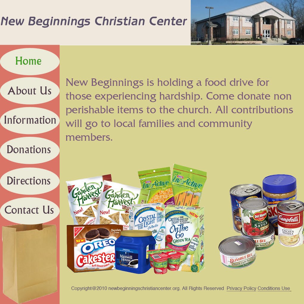
When first thinking about my design for this web project, I immediately thought of one of the examples from class of a student whom did a web design for her sorority’s (Delta Gamma) Anchor Splash philanthropy event. Since I was doing a web design for an event for my sorority, I wanted to use similar design ideas. I started with a base that had a header container, navigation bar container and a container for specific information pertaining to that page. My header remained the same throughout each of my pages to keep everything consistent. It had the name of the webpage event, a brief sub-header and a picture representing the sorority. To represent that the sorority works with Prevent Child Abuse America, I placed the logo on the bottom right of each page. The viewers eyes exit a page on the bottom right and so I thought putting it there would make viewers recognize the image as they left the website. It also made the website more official because it was a distinct logo that many are familiar with. The toolbar also remained consistent throughout each page of my web design so that the viewer did not get confused when navigating throughout the website. However, to highlight what specific page one was on, I changed the color of the category. My main (biggest) container would hold the information pertaining to each page. I tried to remain consistent by using a feathered picture, a header and then smaller text explanations. However, on the Donate and Directions page where I found it necessary to use two pictures, I formatted it with two diagonal pictures and diagonal textboxes. I tried to use typographic hierarchy for each page by using a bigger size font for the header and got progressively smaller as I placed each textbox beneath. I tried to keep my design very simple and clean because I find that these characteristics lend to easy accessibility and navigation. My main concern was consistency because I knew if each page looked similar, then a person would become familiar with the ways of the website. They then would be able to find the information they need easily, which is most beneficial to the success of a website.
Typeface Information
I had previously made a poster for this event. In order to remain consistent to the event’s previous design, I chose to use the same font, Aachen Std Bold. I liked the font for this event because it represented the idea of building. It was also a fun (not so serious) font and this event was supposed to be playful and enjoyable. This font, however, had low readability as a body text. I had just watched the documentary about the font Helvetica and was truly inspired by the simple but powerful characteristics of the font. I chose to use it for my body text because it fulfilled my want of a simple sans serif. I didn’t think it was necessary to use more than two fonts because it would be too much of a distraction. I think the boldness of the Aachen Std and the simplicity of the Helvetica complimented each other while providing a balance.
Images and Color
Throughout my whole web design, I stuck to four main colors (teal, navy, yellow, white). The use of only four main colors made the web design extremely consistent, which I was aiming for. I chose to use blue and yellow because those are the colors of the sorority. I focused on the color blue because that is the universal color of Prevent Child Abuse America. I used the yellow for the text because as a lighter color, it would be more easily read over the background blue color. My background is a gradient because I thought it added some texture to my web design.
Most of the images I used were my personal images from throughout my past two years in the sorority. It was hard for me to find specific images from the event but I tried to correlate the images I had to the event’s purpose as much as I could. The Donate and Directions pages are the only ones where I used outside images. I cropped and feathered almost all of my images in Photoshop before I placed them into my website. For the mapquest image and the donation form, I took snapshots from the website and placed them into Photoshop.
Friday, April 30, 2010
Web Design- Mikaelian
Web Design Project - Seo


Concept
The event I chose for web design project is “Syracuse Festival of Races”. It is a annual festival event that I think it is good for people in Syracuse to know about this festival. For this website, I used a silhouette of men running as a logo for this event. I tried to put fewer contexts on the website and summarize the information that people need to read.
Links
Since the event of this website is straightforward, I tried to find images to help people understand this website clearly by looking at the images. The color I put for each navigation bar is consistent with the color of headings. I chose the color carefully because the highlighted color may distract people from reading the information. All the pictures of people are from the official website Syracuse Festival of Races.
Font
The typeface I chose for this website is Arial for all headings and body contexts because I think Arial is not only a great typeface for reading information but also a good for heading when its bold. For the title of the event Syracuse Festival of Races, I chose Cooper Gathoam because I wanted to chose different typeface but at the same time, it shows similarity with other texts.
Color
I used black background for my navigation bar, and for each color link, the color is directly traced for the image of silhouette on the top right corner. Headings for each page also show consistency with color.
FISH


Mel Fish
4/30/2010
Rationale | Web Design
Concept
The event in which this website website was created for is called ‘Get on the Ball.’ The direct beneficiary is the Jim and Juli Boeheim foundation, and I felt that it was essential that this was a prominent theme throughout the design. To achieve this, I cropped the logo of the Jim and Juli Boeheim foundation, and made it the consistent header for each of my links. It adds a sense of legitimacy to my site, and attracts the reader’s interest throughout their visit.
Links
‘Get on the Ball’ is a simple event. It does not require much explanation, so I determined that simple, straightforward links were appropriate. Each of the pages maintains visual consistency, in that they each are designed within a 2 layer grid. Each page has at least two images, and the text is located in the corners of each page. For my navigation bar, I used a rollover, in the form of a ball, to indicate which page the user is visiting. I transformed the image opacity to 38%, which allows the ball to be prominent and visible, but still allows the text on the navigation ball to be the dominant visual entry point.
Font
For my navigation bar, I used the font Friz Quadrata Standard Regular. It is easily readable, and it effectively coincided with the translucent roll-over ball. My body font was Verdana Regular. It is an easily readable font, and user friendly. For my privacy information, I utilized Helvetica. It adds a sense of hierarchy, and it also user-friendly.
Color
The RGB for my navigation bar is 242, 101, 34. To maintain visual consistency, I used a gray to white gradient. It is inspired from the logo that I use at the top of my design, and adds a little spice to the overall website.
Thursday, April 29, 2010
Leibovitz lecture- Mikaelian
Annie Lebowitz Lecture - Igbeare
Website Design - Rinder


Subject Choice:
I chose to use the same nonprofit event that I used for my poster design project. I also used a similar color pallet to the one used in my poster: shades of pink.
Layout and Design:
I used the 16-collumn grid to create my design. For my layout, I used the pages: Home, Sponsors, About, Class Info, Contact us, and Class Schedule. I put these in a navigation bar across the top of the page for easy visibility. The title of the event, Pilates for Pink, is across the top of the navigation bar.
I kept the overall design of my website very clean. On most of the pages, I used a rounded, white box to hold the text. I included one picture on each of the pages (besides the Sponsors page, and the Class Schedule page). I used a smaller rounded-edge box to hold the title of the pages. On some of the pages, I overlapped the text box and the picture to give it a sense of layering and dimensionality.
I added the Facebook and Twitter logo since most websites today have some form of social media access on their websites. I also added Privacy Policy, Copyright Information, and Help across the bottom of the website.
Typefaces:
For the title of the web page, I kept the letters lowercase to make it seem approachable and low-key. The event is Pilates, which as a form of relaxation and strength training, should be relaxed, and so should the type. I put a gradient on the text to give it a more 3-dimensional look.
I used the same font, Myriad Pro, in different sizes and weights to give the website visual continuity. I thought the font, a sans serif, would work well on the web. It is easy to read and had a large family to work with.
The color of the navigation bar text is white in its original state, and the same color (R252, G195, B234) as the webpage’s background in the mouse-over state. The text in the white text boxes are is the same color as the background of the navigation bar (R237, G115, B119). This also gave the website visual continuity.
Wednesday, April 28, 2010
COHN- web post


For my web design I decided to use the same not-for-profit that I did for my poster design. I know a lot about the organization because the owner of my camp is on the board of directors and has given me some key insight as to how they attract donations. The group tries to balance between professional and kid-friendly, being that the group mission is to provide kids with money to attend summer camps.
I decided to use Helvetica throughout my design, because within the family there were different font types such as regular, bold, bold oblique, and italic, that would give me some differentiation throughout my pages while keeping a consistent feel. For my headline I put the group’s name, SCOPE, which stands for Summer Camp Opportunities Provide an Edge, which I put under the headline. I put the organization’s logo on the top right of the headline. Directly under I put a toolbar with links to different pages. The colors I used throughout were a dark green, like grass, a light blue for the sky, and yellow for the sun. Although it is not expressed on the webpage I did it with the intention that any viewer will get the idea based off the group’s objectives.
I put a lot of different links throughout my design, starting with the home page, which details the event, with a registration link. After the event page and registration page the rest of my site is focused on the group itself, with links such as about us, history, donate, and contact us. The consistency I went with was having the headline and the toolbar on each page, and then a picture in the top right corner under the headline. To the left of the picture is the title of each page, such as ‘registration,’ or ‘history.’ On the “about us” page I created a second toolbar of links which say ‘scope camps,’ and ‘exec. Board.’ I felt that this second toolbar for “about us” gave it a more realistic look because any page of this sort would most likely have more than one linked page.
My main font throughout is white on a blue background, which I used for all of the headlines except when there was a mouse over in which I used the green from the header. For information or other related containers I used black to give it a contrast from the white type seen throughout. All of the mouseovers, whether it be on the toolbar or in the container itself, is the dark green used in the header. I think the use of green, white, blue, yellow, and black throughout is very consistent and gives a feeling of visual continuality from page to page. Each page has a similar design with some modern changes, but the skeleton on each page, with the header, toolbar, logo, and picture on the top right make for a visually appealing and continual design.
Photos- All pictures were taken from the group’s website, scope-ny.org
Web Project - Igbeare


 Design Strategy:
Tuesday, April 27, 2010
Week Fourteen Part 2, Stefaniak


Strategy:
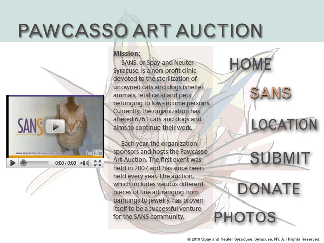
Since I had already created a poster for the Pawcasso art auction event, I wanted to be able to utilize my design in other ways. Because the event is annual, I thought that creating a website design for it would be the perfect way to go about expanding my design. Therefore, the website mirrors the poster design in several ways, using a similar color scheme and style.
In order to create an effective design, I started out with an enter page. When I go to websites, I feel as if pages that start with a big visual that you must navigate past to get to the actual website builds up intensity and aggrandizes the website. For this reason, I created an enter page with the visual large and prominent in the center, leading the viewer to the rest of the information about the event. All the pages that follow consistently follow the pattern of navigation bar on the right to frame the faded cat picture, and information in the center for easy readability. I used the grid mainly to center and lay out my design.
Typefaces:
Though the website is very similar to the poster design, I used all sans serif typefaces on the website. I felt that fonts such as these, Grotesque MT Std, Myriad Web Pro, Helvetica LT Std, and Myriad Pro, were more consistent with web readability than the serif fonts used in my poster design. In addition, all fonts except for the picture caption have a drop shadow effect on it. Since 3d visuals are more interesting than flat ones, I thought adding a shadow to the type would create dimensionality and interest.
Week Fourteen, Stefaniak


Strategy:
Since I had already created a poster for the Pawcasso art auction event, I wanted to be able to utilize my design in other ways. Because the event is annual, I thought that creating a website design for it would be the perfect way to go about expanding my design. Therefore, the website mirrors the poster design in several ways, using a similar color scheme and style.
In order to create an effective design, I started out with an enter page. When I go to websites, I feel as if pages that start with a big visual that you must navigate past to get to the actual website builds up intensity and aggrandizes the website. For this reason, I created an enter page with the visual large and prominent in the center, leading the viewer to the rest of the information about the event. All the pages that follow consistently follow the pattern of navigation bar on the right to frame the faded cat picture, and information in the center for easy readability. I used the grid mainly to center and lay out my design.
Typefaces:
Though the website is very similar to the poster design, I used all sans serif typefaces on the website. I felt that fonts such as these, Grotesque MT Std, Myriad Web Pro, Helvetica LT Std, and Myriad Pro, were more consistent with web readability than the serif fonts used in my poster design. In addition, all fonts except for the picture caption have a drop shadow effect on it. Since 3d visuals are more interesting than flat ones, I thought adding a shadow to the type would create dimensionality and interest.
Web site | Palladino


Choice of Event:
I chose the redesign the Web site for the Autism Move-A-Thon in Orange County, New York because I wanted to stick with a non-profit event for Autism, but a different event than what I did my poster project on. I chose this event because it’s local to my hometown and I have volunteered at the event for many years in the past. The event does have it’s own Web site as a link on the Web site of its parent foundation, the Mental Health Association in Orange County. I wanted to redesign the Web site because the it looks as if the current site was just put together quickly to ensure people could get basic information about the event online. However, it’s not visually stimulating or coherent.
I decided to create three basic containers for my Web site: the title bar at the top, the navigation bar on the left side, and the primary information container in the middle. I chose to make the containers blue against a white background because I wanted to keep the site looking clean, yet colorful, using only a few primary colors.
Typefaces:
I chose Helvetica Rounded for the title of the Web site and the navigation bar because I wanted a simple, sans serif typeface to accompany the simplicity of the Web site’s design. I varied between weights and colors on the navigation bar depending on which page is being viewed. For the body text, I chose Optima, a humanist sans, to keep my entire site written in sans serifs to ensure readability. I also like the contrast of Optima’s thin strokes to Helvetica Rounded’s bold appearance.