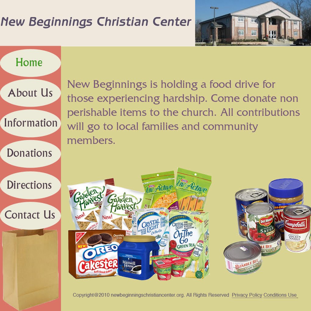
Welcome to the Official Class Blog of GRA217- Section 4


Friday, April 30, 2010

Web Design- Mikaelian

Hierarchy
I used hierarchy in my web design to provide viewers with information in an orderly manner that would slowly lead them to donating to the philanthropy. The top page that says “Kappa Alpha Theta Fraternity Presents: Theta Bowl” is present on every single page, so the viewer has a constant reminder of what the event is. I also included a picture of boys playing in Theta Bowl so people instantly know what the event entails. Since the homepage is the first thing visitors will see, I decided to put a nice welcome message on the front that explains what Theta Bowl is and who participates in it. I then decided to make “About CASA” the second page so viewers can learn more about the organization and what Theta Bowl is making money for. The third page is a photo gallery, so people can see how much fun the event is. After viewers see these three pages, I am hoping that they will be inclined to sign up to participate in the philanthropy or donate to the cause, which are the third and fourth pages. The last page is a contact page, in case after viewing the rest of the website visitors would still like to know more information about Theta Bowl, Kappa Alpha Theta Fraternity, or CASA in general.
Usability
I wanted to make my website really easy to use, so I decided to keep it really simple with a traditional task bar across the top of the page and one text box that would hold the information for each page. Nonprofit event websites should be simple so people can navigate easily throughout the page, so I wanted to keep the information minimal and in small paragraphs. To get to each section, users simply have to click on the link to each page and there is one page with all the information they need. There are no sublinks, etc. since that can get too confusing and viewers can get lost clicking from link to link.
Visual message/Audiences
I wanted my visual message to be that Theta Bowl is a fun event that raises a lot of money for a great cause. The audience is most likely going to be college males, since that’s the demographic that participates in Theta Bowl, but Kappa Alpha Theta alumni and family members will probably also look at the site to learn more about the Chi chapter’s philanthropy, and to donate money to the cause. Because of this I wanted to create a layout that stays true to the philanthropy that would make boys want to participate, but I also wanted it to be friend and inviting to alumni and the older audience that may be viewing the website. In order to do so, I made the layout a combination of boyish and girly by utilizing two different font styles (explained below), and including pictures of both sorority sisters and football teams that participated in past Theta Bowls. The pictures of the sorority members give viewers and idea of the type of girl in Theta at Syracuse, and hopefully evoke that the event is a fun, wholesome event. The pictures of the males should show how much fun they’re having, and how into the philanthropy the boys get. I also feathered all the photos to give off a friendly, happy vibe that made the pictures seem reminiscent of nice memories.
Typography/Color choices
The main fonts I used for my website are Antique Olive Std. and Stencil. I used Stencil for “Theta Bowl” at the top of the website and important headlines. I used this font because it is a tough-looking font that fits the football theme of the website well. I chose Antique Olive Std. because it is a simple font that has a slight girliness to it, which I think compliments the boy-ish Stencil font and makes the site to both men and women. For the navigation bar, I used Antique Olive Std. in a black font, and to show what page I was on I turned the font of that page (i.e. home, about casa, etc.) to Stencil in a larger font size and white color to make it stand out from the rest of the navigation bar. I also used Verdana for large bodies of text (the home page and about casa page). I use Antique Olive Std. in 9 pt. for captions.
The main colors I used are black, white and yellow (a replacement for gold) since those are my sorority’s colors. I also felt like they worked out well since they aren’t too girly and work well with the flag football philanthropy. I decided to make the main background white, and used a black container to hold the main text for each page. I also made the top bar black and the navigation bar yellow (R=255 G=231 B=65) so it would stand out. Most of the text is white, although I did use yellow if I wanted to make certain words stand out, and also for the donations and sign up page to contrast from the white text boxes.

Web Design Project - Seo


Concept
The event I chose for web design project is “Syracuse Festival of Races”. It is a annual festival event that I think it is good for people in Syracuse to know about this festival. For this website, I used a silhouette of men running as a logo for this event. I tried to put fewer contexts on the website and summarize the information that people need to read.
Links
Since the event of this website is straightforward, I tried to find images to help people understand this website clearly by looking at the images. The color I put for each navigation bar is consistent with the color of headings. I chose the color carefully because the highlighted color may distract people from reading the information. All the pictures of people are from the official website Syracuse Festival of Races.
Font
The typeface I chose for this website is Arial for all headings and body contexts because I think Arial is not only a great typeface for reading information but also a good for heading when its bold. For the title of the event Syracuse Festival of Races, I chose Cooper Gathoam because I wanted to chose different typeface but at the same time, it shows similarity with other texts.
Color
I used black background for my navigation bar, and for each color link, the color is directly traced for the image of silhouette on the top right corner. Headings for each page also show consistency with color.

FISH


Mel Fish

4/30/2010

Rationale | Web Design


Concept

The event in which this website website was created for is called ‘Get on the Ball.’ The direct beneficiary is the Jim and Juli Boeheim foundation, and I felt that it was essential that this was a prominent theme throughout the design. To achieve this, I cropped the logo of the Jim and Juli Boeheim foundation, and made it the consistent header for each of my links. It adds a sense of legitimacy to my site, and attracts the reader’s interest throughout their visit.

Links

‘Get on the Ball’ is a simple event. It does not require much explanation, so I determined that simple, straightforward links were appropriate. Each of the pages maintains visual consistency, in that they each are designed within a 2 layer grid. Each page has at least two images, and the text is located in the corners of each page. For my navigation bar, I used a rollover, in the form of a ball, to indicate which page the user is visiting. I transformed the image opacity to 38%, which allows the ball to be prominent and visible, but still allows the text on the navigation ball to be the dominant visual entry point.

Font

For my navigation bar, I used the font Friz Quadrata Standard Regular. It is easily readable, and it effectively coincided with the translucent roll-over ball. My body font was Verdana Regular. It is an easily readable font, and user friendly. For my privacy information, I utilized Helvetica. It adds a sense of hierarchy, and it also user-friendly.


Color

The RGB for my navigation bar is 242, 101, 34. To maintain visual consistency, I used a gray to white gradient. It is inspired from the logo that I use at the top of my design, and adds a little spice to the overall website.


Thursday, April 29, 2010

Leibovitz lecture- Mikaelian

Annie Leibovitz is an extremely inspirational photographer. She began her professional work at Rolling Stone in the 70s, photographing events such as Nixon stepping down and the famous John & Yoko Ono cover. She has had more accomplishments than any other photographer, and now holds the spot for the first and second magazine cover ever. Leibovitz says she loves photographing landscapes, even though she has shot hundreds upon hundreds of amazing covers for magazines like Rolling Stone, Vanity Fair and Vogue. She showed photos of her work, starting off with black and white photos that I thought were truly inspiring, since they were done with no digital photography what-so-ever. She then showed photos all the way up to her family and current work, the home of a famous poet. My favorite photograph that she showed was an image of a person standing in between two huge stone walls, and in the slit of the stone walls you could see a beautifully structured gothic building. The woman in the photo was also standing on a rock and she is so tiny that the size of the stone walls and the white building you see through the slit almost resembles the woman seeing a white light. The woman in the photo is one of her dear friends who has since passed away. Annie Leibovitz is definitely the most famous photographer of all time, and it was amazing to hear her speak about her work and tell the stories behind the photos- especially how she got the shot of Queen Elizabeth "outdoors" (it was actually a backdrop) and the story behind her favorite photo, the photograph of her mother.

Annie Lebowitz Lecture - Igbeare

I really enjoyed Lebowitz's lecture. She read a few excerpts for her book. I liked how she described her process while showing us the images. The image of Queen Elizabeth was phenomenal. The background and her pose really added to the whole image. I also enjoyed the black and white photos she showed. I thought it gave the image authentic feel. I thought the images of the dancers were amazing. There was one in particular that I liked a lot. Two dancers were photographed at the beach. One was lifting the other up and the man who was lifted was in a pose. I could feel the emotion coming from the image. Overall, I liked Lebowitz's lecture. I thought she had really good advice for up and coming photographers as well as students in the media industry. I could tell she was really passionate and genuine about the work she did as she spoke to the audience.

Website Design - Rinder


Subject Choice:

I chose to use the same nonprofit event that I used for my poster design project. I also used a similar color pallet to the one used in my poster: shades of pink.

Layout and Design:

I used the 16-collumn grid to create my design. For my layout, I used the pages: Home, Sponsors, About, Class Info, Contact us, and Class Schedule. I put these in a navigation bar across the top of the page for easy visibility. The title of the event, Pilates for Pink, is across the top of the navigation bar.

I kept the overall design of my website very clean. On most of the pages, I used a rounded, white box to hold the text. I included one picture on each of the pages (besides the Sponsors page, and the Class Schedule page). I used a smaller rounded-edge box to hold the title of the pages. On some of the pages, I overlapped the text box and the picture to give it a sense of layering and dimensionality.

I added the Facebook and Twitter logo since most websites today have some form of social media access on their websites. I also added Privacy Policy, Copyright Information, and Help across the bottom of the website.

Typefaces:

For the title of the web page, I kept the letters lowercase to make it seem approachable and low-key. The event is Pilates, which as a form of relaxation and strength training, should be relaxed, and so should the type. I put a gradient on the text to give it a more 3-dimensional look.

I used the same font, Myriad Pro, in different sizes and weights to give the website visual continuity. I thought the font, a sans serif, would work well on the web. It is easy to read and had a large family to work with.

The color of the navigation bar text is white in its original state, and the same color (R252, G195, B234) as the webpage’s background in the mouse-over state. The text in the white text boxes are is the same color as the background of the navigation bar (R237, G115, B119). This also gave the website visual continuity.


Wednesday, April 28, 2010

COHN- web post


For my web design I decided to use the same not-for-profit that I did for my poster design. I know a lot about the organization because the owner of my camp is on the board of directors and has given me some key insight as to how they attract donations. The group tries to balance between professional and kid-friendly, being that the group mission is to provide kids with money to attend summer camps.

I decided to use Helvetica throughout my design, because within the family there were different font types such as regular, bold, bold oblique, and italic, that would give me some differentiation throughout my pages while keeping a consistent feel. For my headline I put the group’s name, SCOPE, which stands for Summer Camp Opportunities Provide an Edge, which I put under the headline. I put the organization’s logo on the top right of the headline. Directly under I put a toolbar with links to different pages. The colors I used throughout were a dark green, like grass, a light blue for the sky, and yellow for the sun. Although it is not expressed on the webpage I did it with the intention that any viewer will get the idea based off the group’s objectives.

I put a lot of different links throughout my design, starting with the home page, which details the event, with a registration link. After the event page and registration page the rest of my site is focused on the group itself, with links such as about us, history, donate, and contact us. The consistency I went with was having the headline and the toolbar on each page, and then a picture in the top right corner under the headline. To the left of the picture is the title of each page, such as ‘registration,’ or ‘history.’ On the “about us” page I created a second toolbar of links which say ‘scope camps,’ and ‘exec. Board.’ I felt that this second toolbar for “about us” gave it a more realistic look because any page of this sort would most likely have more than one linked page.

My main font throughout is white on a blue background, which I used for all of the headlines except when there was a mouse over in which I used the green from the header. For information or other related containers I used black to give it a contrast from the white type seen throughout. All of the mouseovers, whether it be on the toolbar or in the container itself, is the dark green used in the header. I think the use of green, white, blue, yellow, and black throughout is very consistent and gives a feeling of visual continuality from page to page. Each page has a similar design with some modern changes, but the skeleton on each page, with the header, toolbar, logo, and picture on the top right make for a visually appealing and continual design.

Photos- All pictures were taken from the group’s website, scope-ny.org

Web Project - Igbeare


Design Strategy:

I decided to do my website on a local food drive that takes place in my church. I kind of took the idea from the outreach dinner the church usually has. This food drive is an ongoing event but when they have the dinner they give the items to those in need. For the color palette I wanted something light and colorful. Since I knew I was going to use pictures that popped I didn't want the background colors to be too distracting. I decided to focus mainly on the food drive. I wanted a grocery bag at the sidebar with the navigational links because I didn't want the audience to forget what the event was about.
For my fonts I used Friz Quadrata Standard for all my body texts. I then used Benguiat Standard for my heading. Lastly, I used Albertus Standard for my navigation bar. I wanted all the fonts to compliment each other without competing with each other. I thought they looked visually appealing together.

Tuesday, April 27, 2010

Week Fourteen Part 2, Stefaniak


Strategy:

Since I had already created a poster for the Pawcasso art auction event, I wanted to be able to utilize my design in other ways. Because the event is annual, I thought that creating a website design for it would be the perfect way to go about expanding my design. Therefore, the website mirrors the poster design in several ways, using a similar color scheme and style.

In order to create an effective design, I started out with an enter page. When I go to websites, I feel as if pages that start with a big visual that you must navigate past to get to the actual website builds up intensity and aggrandizes the website. For this reason, I created an enter page with the visual large and prominent in the center, leading the viewer to the rest of the information about the event. All the pages that follow consistently follow the pattern of navigation bar on the right to frame the faded cat picture, and information in the center for easy readability. I used the grid mainly to center and lay out my design.

Typefaces:

Though the website is very similar to the poster design, I used all sans serif typefaces on the website. I felt that fonts such as these, Grotesque MT Std, Myriad Web Pro, Helvetica LT Std, and Myriad Pro, were more consistent with web readability than the serif fonts used in my poster design. In addition, all fonts except for the picture caption have a drop shadow effect on it. Since 3d visuals are more interesting than flat ones, I thought adding a shadow to the type would create dimensionality and interest.

Week Fourteen, Stefaniak


Strategy:

Since I had already created a poster for the Pawcasso art auction event, I wanted to be able to utilize my design in other ways. Because the event is annual, I thought that creating a website design for it would be the perfect way to go about expanding my design. Therefore, the website mirrors the poster design in several ways, using a similar color scheme and style.

In order to create an effective design, I started out with an enter page. When I go to websites, I feel as if pages that start with a big visual that you must navigate past to get to the actual website builds up intensity and aggrandizes the website. For this reason, I created an enter page with the visual large and prominent in the center, leading the viewer to the rest of the information about the event. All the pages that follow consistently follow the pattern of navigation bar on the right to frame the faded cat picture, and information in the center for easy readability. I used the grid mainly to center and lay out my design.

Typefaces:

Though the website is very similar to the poster design, I used all sans serif typefaces on the website. I felt that fonts such as these, Grotesque MT Std, Myriad Web Pro, Helvetica LT Std, and Myriad Pro, were more consistent with web readability than the serif fonts used in my poster design. In addition, all fonts except for the picture caption have a drop shadow effect on it. Since 3d visuals are more interesting than flat ones, I thought adding a shadow to the type would create dimensionality and interest.

Web site | Palladino


Choice of Event:

I chose the redesign the Web site for the Autism Move-A-Thon in Orange County, New York because I wanted to stick with a non-profit event for Autism, but a different event than what I did my poster project on. I chose this event because it’s local to my hometown and I have volunteered at the event for many years in the past. The event does have it’s own Web site as a link on the Web site of its parent foundation, the Mental Health Association in Orange County. I wanted to redesign the Web site because the it looks as if the current site was just put together quickly to ensure people could get basic information about the event online. However, it’s not visually stimulating or coherent.

I decided to create three basic containers for my Web site: the title bar at the top, the navigation bar on the left side, and the primary information container in the middle. I chose to make the containers blue against a white background because I wanted to keep the site looking clean, yet colorful, using only a few primary colors.


Typefaces:

I chose Helvetica Rounded for the title of the Web site and the navigation bar because I wanted a simple, sans serif typeface to accompany the simplicity of the Web site’s design. I varied between weights and colors on the navigation bar depending on which page is being viewed. For the body text, I chose Optima, a humanist sans, to keep my entire site written in sans serifs to ensure readability. I also like the contrast of Optima’s thin strokes to Helvetica Rounded’s bold appearance.

Website | Murphy


Erica Murphy | Website rationale

Non-for-profit event

My non-for-profit event is affiliated with a club that I was involved with in High School. I chose this specific club because it was the club I was the most involved with in high school. I chose the annual bowl-a-thon because I had my own pictures from previous events. I thought that this would make it easier to create a design when I already knew what visuals to use.

Design strategy

I chose to use a 12-grid system because I felt that my containers were too large for the 16-grid system. I also thought that spreading objects and type across two columns was easier to design. I used the same color pink throughout each page and just changed the opacity to create visual continuity. Pink is the official color of the Susan B. Komen foundation, so I thought this worked well with the theme of the bowl-a-thon. I used a bowling ball to dictate which page was the main page and kept the circle theme going with the shape of my pictures. I also used a bowling pin on each page to hold extra information and to help contain the main text.

Choice of Type

I wanted to use somewhat girly and fun fonts to contrast the brown, boyish colors of the bowling ally. I couldn’t find the font I wanted for the headline in suitcase, so I found a font on dafont.com titled Sooperfresh. I used Emmascript for the links on my web pages and trade gothic LT Std for the body text. The script and sans serif fonts provide a nice contrast to each other.

Monday, April 26, 2010

Schwartz - Week Fourteen

Design Strategy

I immediately knew that I wanted to use Phi Hoops for my website design. I really enjoyed creating a poster for this event because it is relevant to me, as my sorority plans it every year. Similarly, I was so interested and enthralled by this project, as I was able to extend my passion for AEPhi and our events into my schoolwork once again. For my website design, I chose to focus around the pictures that were already in my possession. I got lucky, because I had a large selection of photos to choose from, as I helped organize this event in the fall. I chose to pick links to pages that applied to the event specifically and I knew enough information about so that I could provide the most information possible. I tried to maintain visual consistency throughout by keeping a similar model for all pages.

Typefaces

For my typefaces, I chose Antique Olive Std for my header and side bar. I like this font because it compliments Verdana, my body text, as they are both sans serif. I thought this was a fun test to use for headers, because it attracts attention but adds a playful touch, which is applicable to the event. These are the two typefaces I used consistently throughout the web design.

Color

I chose to use green and white as my primary colors for my site, because they are my sorority’s colors and I was also able to pull them out from the logo. I kept consistency for using these colors throughout, and added a touch of orange for the basketball touch. This is the only presence of color in my project.

Images

Sidebar Image: http://www.afghanbuzz.com/events/wp-content/uploads/2009/01/british-performance-basketball-logo-31.jpg

Logo: http://www.rowan.edu/clubs/aephi/pediatric-aids-foundation.gif

Payment screenshot: www.pedaids.org

All other images are personal photographs taken by myself or friends at previous Phi Hoops events.


Friday, April 23, 2010

Week Thirteen | LaSorsa


The Apple website provides a perfect example of web hierarchy. The top toolbar lists the main sections of the Apple company including Support, Store and iTunes. These categories are on top because they are the first step in filtering all the information the website provides down to one specific thing a person is looking for. Once a category is clicked, the top scroll bar shows all of the items available. For your convenience, Apple supplies a picture and the name (just incase you are unaware of either). The main advertisement in the middle provides the latest news, depending on the subject of that certain page. If all of that does not allow you to find what you are looking for, there is a search bar on the top right. This website is very easy to navigate and does so well because of its visual hierarchy.

Week 14 - Schwartz

This is a good example of visual hierarchy on a website. This site is designed in a visually appealing way because the images at the top attract your attention, and your eye is then drawn to the text and links on the righthand side. The eye is led throughout the page in a systematic way. The headlines are bigger than the body text, so it is clear what is important to look at first. The site is set up in an easily accessible way.

Week 13- Mikaelian


The Syracuse University website is an excellent example of hierarchy. It is obvious that there are 4 vertical grids, the middle one being made into one double-sized column. It also uses the grid effectively to separate the information being shown on the website, and to lead viewers to where they need to go. The site is also effective because the picture at the top of the page catches the readers attention. This picture is also where the links to the most commonly sought-out information is, so people can easily find them. The colors- orange, white and gray- are also effective because they're clean, but also grab people's attention. The orange type used for headlines makes people read them, And the different shades of gray effectively separate the white boxes, making it easier for viewers to tell where certain information starts and stops.

Web Hierarchy - Seo


Web hierarchy determines how content is well organized on the website and provides convenient tools to find the information for people. Goodmagazine.com is a great example of web hierarchy that has an excellent website structure and visual aspects. The navigation bars which are very noticeable and it has many categories for people to find the information they want to get. Additionally they have consistency in use of color which the light blue color used in both for their images and contents. The typeface of the body content is Arial which is easy for people to read. The images and contexts matched well that images do not distract people to read the information.

COHN- Magazine Post


For my magazine layout it was hard at first to decide where to place pictures, being that the story was about two new stadiums. At first I wanted to put two pictures of the old stadiums the Mets and Yankees played in on the cover but it looked awkward and too crammed. I decided I didn't need pictures of the old stadiums so I got creative with the new stadium pictures. On the first spread I have two pictures of the facade of each stadium facing inwards towards my deckhead, with plenty of white space above for my headline. Then on the second page I put two inward facing pictures of the inside of each stadium, sort of welcoming the reader to the new stadiums with the text. For my text I used Futura because it felt new and fitting for the new stadiums. Because of the amount of images I put in the article I kept my text more traditional by using Times font. My sidebar fits in well with the story because it is about the really expensive ticket prices which is mentioned throughout the article.