
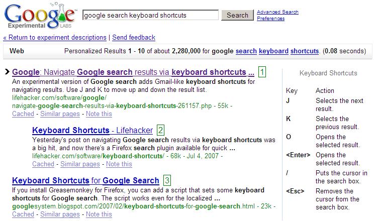
Search engines, like this, provide perfect examples of typographic hierarchy. The results from this search follow a format, by Google, that make it easier to find exactly what the searcher is looking for. The results that stand out immediately are the titles of the web pages. They are bolder, bigger and a different color than the rest of the type. These characteristics draw the reader directly to the title. Also, the words the searcher typed in are bold while the rest of the words are normal. These words are still in the title, however, they can be looked over by the reader for a quicker search. From there, the reader follows the type down to read a brief description of the website. In this regular, black type are highlighted words. While the reader skims the text, these bold keywords stand out and relay to the reader how relevant this website is to their specific search. This type is in black for it is probably the least likely thing a reader will pick up on if they are trying to look something up quickly. The URL is in green which stands out and gives the reader a sense of where he or she will be taken to if they click on the link. It is easy for the reader to recognize the URL and see if they have used it before. The keywords are again, in bold. Lastly, if there are two results from one web page, Google will indent the second title. The indent will either allow the reader to learn more about the web page or bypass it if they disliked the first title. If the reader has already visited the site, the link turns purple. This indication is helpful in letting the searcher know that they have already checked out this search and to try a different one. Overall, Google does a great justice to searchers worldwide. By formatting their text in a typographic hierarchy, their results are clear and easy to read!
No comments:
Post a Comment